
The information presented within this blog is aimed at website owners seeking to learn the ropes of web accessibility. Technical elements are described in layman’s terms, and, as a rule, all topics pertaining to the legalities of web accessibility are presented in as simplified a manner as possible. This guide has no legal bearing, and cannot be relied on in the case of litigation.
39% of consumers appreciate color more than any other component of a website’s design. It is safe to say, then, that choosing the right color scheme or combination can have a deciding effect on your brand and website. Given that certain color schemes resonate with some website visitors while alienating others, website owners and designers have a lot to consider during the design process.
However, for this process to yield the desired results, it will need to account for a significant group:
Members of the disability community.
Put simply, if your website features certain color combinations and contrasts, it will be either partially or completely inaccessible to a significant number of people with vision impairments.
Luckily, there are ways of creating a visually striking website that is accessible to all website visitors. And, while every organization should strive to adjust its website’s color schemes so that they are accessible to everyone, certain businesses are mandated by law to do so, under the Americans with Disabilities Act (ADA).
But what makes a color combination or color scheme ADA-compliant?
How should website and business owners go about selecting colors that will be fully accessible to all website visitors?
In this blog, we will cover everything you need to know about ADA-compliant colors. We will show why choosing the right color combination is so important, and what you should expect if your website is found to feature color schemes and contrasts that stand in violation of the ADA. Of course, we will also show you how to choose ADA-compliant colors, and highlight those you should avoid.
ADA-compliant colors: an overview

The Americans with Disabilities Act (ADA) exists to protect people with disabilities from discrimination when seeking employment and when attempting to access goods and services.
Under ADA Title III, businesses and organizations considered “public accommodations” must make their services and products accessible to people with disabilities. Businesses that fall under this classification include, but aren’t limited to, hotels, museums, real estate agencies, public transportation, colleges, theaters, restaurants, banks, and many small businesses. However, given that most places of business sell products and services to the public, almost all businesses need to comply with the ADA.
U.S. courts currently apply the ADA to businesses' online domains, as well as to their physical spaces. This means that websites must be accessible to the disability community, under the ADA.
To comply with the law, businesses must ensure that these color schemes and combinations sufficiently contrast so that they can be accessed by people with vision impairments.
WCAG’s role in choosing ADA-compliant colors
While nothing has been codified into law as of yet, U.S. courts frequently reference the Web Content Accessibility Guidelines (WCAG) as the standards that websites should meet to be considered ADA-compliant. Created by the World Wide Web Consortium (W3C), WCAG is arguably the most important standard shaping global web accessibility policy.
Both WCAG 2.0 (i.e., an older version of these guidelines) and WCAG 2.1 (i.e., the most up-to-date version of WCAG) include extensive instructions for website owners and designers looking to select accessible colors. For the most part, these sections touch on:
- Selecting a color contrast between text and its background that ensures each element is properly visible
- Selecting a color contrast between certain meaningful non-text items that ensures optimal visibility
- Not using color as the only visual means of conveying information, indicating an action, prompting a response, or distinguishing a visual element
- Ensuring that content that relies on color to convey information is also available in a non-color format, such as through text, patterns, or other visual cues
- Ensuring that visual elements such as charts and maps utilize colors that sufficiently contrast
We will dive deeper into these later in the blog. To skip to that section, you can click here.
The importance of ADA-compliant color schemes
Everyone should be able to access any given website. However, the vast majority of the web is either fully or partially inaccessible to people with disabilities.
When you ensure the colors you leverage within your website comply with the ADA, you do your part in changing this unjust reality. And while doing the right thing is reason enough to pursue ADA compliance, it turns out that creating an inclusive, equitable business environment can pay significant dividends. According to the National Business and Disability Council, businesses that grant easy access for consumers with disabilities received 78% more business from buyers.
Finally, businesses should be aware of the negative ramifications of not complying with the ADA. If your website is found to feature color contrasts and other visual elements that do not conform with WCAG, you open yourself up to receiving ADA website compliance demand letters and, potentially, facing ADA website compliance lawsuits.
ADA-compliant colors: a deep dive

To ensure you are leveraging color in a way that allows everyone to access your website, you need to rely on relevant web accessibility standards. Like with other elements pertaining to web accessibility, the Web Content Accessibility Guidelines (WCAG) will provide you with the necessary instructions on choosing the proper color contrasts, and the best color combinations.
Let’s break these down:
Choose the right color combinations
Many of us can intuitively point toward a pleasing, engaging color combination. However, people with certain vision impairments cannot. While they may seem cool in the design stage, color combinations that are close in hue, saturation, or brightness will prove very challenging to people with vision impairments. Additionally, color combinations that are too bright or too saturated can overwhelm certain website visitors and leave them incapable of properly engaging with a web page.
So, what color combinations should you consider using to ensure your website complies with the ADA?
You should consider the following:
- Black and white: You won’t find a more accessible color combination than this one. And, while you may think it is bland, there are many leading websites that heavily rely on a black and white combination, including Squarespace - an authority on web design
- Green and white: A solid color combination from both an accessibility and design perspective, the green and white combination is used to great effect on Starbucks' website. It’s important to note that there are shades of green that do not sufficiently contrast with a white background
- Blue and yellow: Both far enough away on the color spectrum to allow for sufficient contrast, yellow and blue is a solid, accessible color combination. It’s important to note that there are shades of yellow and blue that do not sufficiently contrast with each other
- Red and white: Red alone can be difficult to read. However, pairing it with white creates a high-contrast combination that works well for text and graphics. It’s important to note that there are shades of red that do not sufficiently contrast with a white background
Color combinations to avoid
There are certain color combinations that tend to be problematic, as they often do not contrast sufficiently. If you are interested in using them, you will need to examine specific shades to see if they properly contrast. These include, but are not limited to:
- Green and red
- Green and blue
- Blue and black
- Yellow and orange
- Yellow and red
- Yellow and green
- Purple and black
- Red and brown
- Blue and purple
Ensure that text is readable
While choosing a highly-contrasting color combination is important, there are specific guidelines you will need to adhere to when it comes to text. Under WCAG 2.1 Level AA, text should have a contrast ratio of at least 4.5:1 with its background. A ratio of 3:1 is sufficient for large text (18-point) or 14-point bold text. This will allow website visitors with visual impairments to actually notice that the text appears, and then to read and understand it. You can read all about this topic in our guide for selecting ADA-compliant fonts.
Here are a few examples of web pages that feature the required contrast ratios:
1. accessiBe

The contrast between text and background is as high as 15.52:1 on accessiBe’s homepage.
2. Beladora

On this web page, the contrast between text and background is as low as 13.24:1 and as high as 21.11:1
3. Nooma
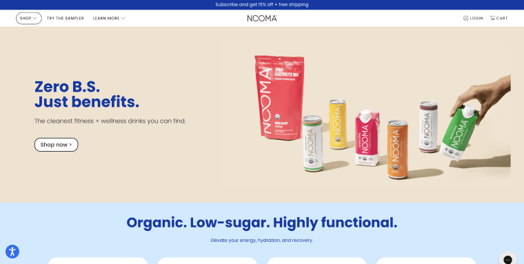
On this web page, the contrast between text and background is as high as 14.74:1.
For more examples of websites featuring highly-contrasting color schemes, we recommend you check out our list of beautiful ADA-compliant websites.
Ensure icons, checkboxes, and other functional graphics feature proper color contrast ratios
WCAG color contrast requirements apply to all meaningful information displayed on your website. This includes text-based information, along with other forms of visual information. The latter includes meaningful icons, interface components, and other graphical objects that are necessary for understanding content or functionality appearing within the website.
Examples of meaningful icons include, but aren’t limited to:
- The trash can icon for deleting files
- The search icon, typically appearing as a magnifying glass
- The thumbs up icon used to like a post
- The arrow-down icon used to indicate a file can be downloaded
To conform with WCAG (and thus comply with the ADA) the colors used for these graphics will need to properly contrast with adjacent colors. This contrast needs to remain intact even when the icon is engaged with (i.e., focused or hovered over).
How can I test whether I’m using ADA-compliant colors?

Using an accessibility or color checker can help you with color selection and ensure text contrasts sufficiently with its background.
Tools that can help with your color selection include:
- ColorPick Eyedropper is a free Google Chrome extension that you can use to determine the exact color of various elements appearing on a web page. The extension will provide you with a cursor with which you can hover over text and images, in order to find their color values in real time
- WebAIM Color Contrast Checker is a free online tool that enables you to examine the contrast between text and background colors on a given website
- Adobe Color Contrast Analyzer enables users to input color values or upload a screenshot to quickly check contrast ratios. With this free tool, you can indicate different areas within an image and check for the contrasts between them
- NoCoffee Vision Simulator simulates different vision impairments to let you see how your content would be seen by people with vision impairments. It’s available for free as a Google Chrome or Firefox extension
- Color Contrast Analyzer is a free Google Chrome extension you can install to analyze an entire web page or parts of it for color contrast. You can also use this tool to analyze color contrasts within images and PDF files
It’s important to note that color combinations and schemes are only one part of a list of elements you will need to examine to determine whether your website is ADA-compliant. To get a precise read on your website’s state of compliance, you can use automated testing tools, like accessScan.
A free ADA website compliance testing tool, accessScan will run a quick, automated audit of your website and examine its level of conformance to WCAG 2.1 Level AA.
After checking your web page’s various design and UI elements, including color contrasts and combinations, accessScan will assign your website a score: Compliant, semi-compliant, or non-compliant. You will also be presented with a more detailed breakdown of your website’s compliance status that you can download as a PDF. Any compliance issues found during the automated test will be highlighted in the report, along with instructions on how to address and fix them.
Click here to use accessScan and find out if your website is ADA-compliant.
ADA-compliant colors: other areas to look out for
Selecting the right colors for your website is a critical component of achieving ADA compliance. However, the ADA applies to other areas of your business, all of which need to exhibit accessible color combinations and ratios. Let's examine two prominent areas you will need to address:
ADA-compliant colors within online documents
To achieve ADA compliance, you will need to address all elements appearing within your website. This includes ensuring you are applying color-related web accessibility best practices to your online documents, as well. For them to be considered ADA-compliant, online documents need to meet a number of requirements, most notably proper tagging to allow for screen reader usage.
Additionally, and similarly to websites, your PDFs and Microsoft Office files (e.g., Word documents) will need to feature sufficiently contrasting colors. It is important to keep this in mind when designing your online documents.
Accessible colors within physical domains
As mentioned above, the ADA applies to businesses’ physical domains, first and foremost. Therefore, choosing the proper color schemes, combinations, and contrasts applies to physical materials presented to both customers and employees.
Signage appearing within stores, offices, and businesses’ physical locations should adhere to the color contrast best practices mentioned above.
You can click here to read more about color contrast for signage under the ADA.
Key takeaways
Creating a well-designed website can bring about significant business results. However, great web design doesn’t merely provide a stimulating, memorable experience for some website visitors while excluding others.
Choosing the right color combination and scheme will go a long way in ensuring your website truly is an inclusive, accommodating environment for people with disabilities. And, while website visitors with visual impairments will definitely benefit from this, adhering to ADA-compliant color best practices will be appreciated by all website visitors, as these best practices allow for optimal text readability and an overall better user experience.